728x90

SITE를 만들어봅시다 !
이번에는 또 다른 형식의 카드 유형으로 사이트 구성을 만들어봅시다.
1. Figma 활용하기
같은 디자인의 카드를 4개씩 총 8개 배열한 형태입니다. 먼저 공통적인 카드의 틀을 만들어 놓고 component 처리를 해서 배열해주면 혹여나 수정사항이 생긴다해도 하나를 수정하면 전체가 똑같이 반영되어 수정이 용이합니다.
2. CSS 살펴보기
<style>
    /* fonts */
    @import url('https://webfontworld.github.io/gmarket/GmarketSans.css');

    .gmark {
        font-family: "GmarketSans";
        font-weight: 500;
    }

    /* reset */
    * {
        margin: 0;
        padding: 0;
    }
    h1, h2, h3, h4, h5, h6 {
        font-weight: normal;
    }
    a {
        text-decoration: none;
        color: #000;
    }
    img {
        width: 100%;
    }

    /* common */
    .container {
        width: 1160px;
        padding: 0 20px;
        margin: 0 auto;
        min-width: 1160px;
    }
    .section {
        padding: 120px 0;
    }
    .section > h2 {     /* +는 형제 바로 밑에 있는 자식은 > */
        font-size: 50px;
        line-height: 1;
        text-align: center;
        margin-bottom: 20px;
    }
    .section > p {
        font-size: 22px;
        font-weight: 3oo;
        color: #666;
        text-align: center;
        margin-bottom: 70px;
    }
    .gray {
        background-color: #f5f5f5;
    }

    /* ir 효과(image replace 효과, 이미지 대체효과 == alt, 스크린 리더기에는 읽히고 우리 눈에는 안보이게) */
    .ir {
        display: block;
        overflow: hidden;
        font-size: 0;
        line-height: 0;
        text-indent: -9999px;       /* 들여쓰기 */
    }

    /* cardType02 */
    .card__inner {
        display: flex;
        flex-wrap: wrap;
        justify-content: space-between;
    }
    .card__inner .card {
        width: 24%;
        position: relative;
    }
    .card__inner .card:first-child {        /* 익스플로어 고려해서 nth 말고 퍼스트찰드로 */
        margin-bottom: 50px;
    }
    .card__inner .card img {
        border-radius: 10px;
        margin-bottom: 20px;
    }
    .card__inner .card .tit {
        font-size: 28px;
        margin-bottom: 10px;
        /* 한줄효과 */
        overflow: hidden;
        white-space: nowrap;
        text-overflow: ellipsis;
        padding-right: 20px;
    }
    .card__inner .card .desc {
        font-size: 18px;
        font-weight: 300;
        color: #666;
        line-height: 1.4;
        /* 세줄효과 */
        overflow: hidden;
        text-overflow: ellipsis;
        display: -webkit-box;
        -webkit-line-clamp: 3;
        -webkit-box-orient: vertical;
    }
    .card__inner .card .more {
        width: 28px;
        height: 28px;
        background-image: url(img/arrow.svg);
        display: block;
        position: absolute;
        right: 0;
        top: 230px;
        border-radius: 5px;
    }
</style>
3. HTML 살펴보기
<body>
<section id="cardType02" class="card__wrap gmark section gray">
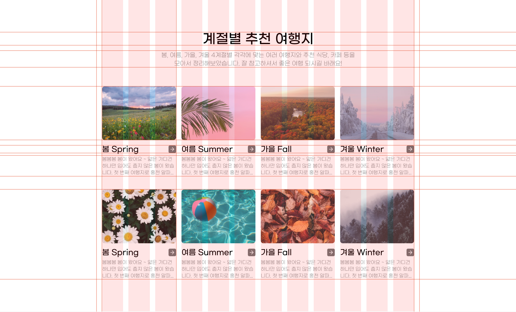
<h2>계절별 추천 여행지</h2>
<p>
봄, 여름, 가을, 겨울 4계절별 각각에 맞는 여러 여행지와 추천 식당, 카페 등을<br>
모아서 정리해보았습니다. 잘 참고하셔서 좋은 여행 되시길 바래요!
</p>
<div class="card__inner container">
lt;article class="card">
lt;img src="img/card_bg02_01.jpg" alt="봄 Spring">
lt;h3 class="tit">봄 Spring</h3>
lt;p class="desc">봄봄봄 봄이 왔어요 ~ 얇은 가디건 하나만 입어도 춥지 않은 봄이 왔습니다. 첫 번째 여행지로 추천 드릴 곳은 홍천 알파카월드 입니다.</p>
lt;a href="#" class="more"><span class="ir">더보기</span>lt;/a>
lt;/article>
lt;article class="card">
lt;img src="img/card_bg02_02.jpg" alt="여름 Summer">
lt;h3 class="tit">여름 Summerlt;/h3>
lt;p class="desc">봄봄봄 봄이 왔어요 ~ 얇은 가디건 하나만 입어도 춥지 않은 봄이 왔습니다. 첫 번째 여행지로 추천 드릴 곳은 홍천 알파카월드 입니다.</p>
lt;a href="#" class="more">lt;span class="ir">더보기lt;/span>lt;/a>
lt;/article>
<article class="card">
<img src="img/card_bg02_03.jpg" alt="가을 Fall">
<h3 class="tit">가을 Fall</h3>
<p class="desc">봄봄봄 봄이 왔어요 ~ 얇은 가디건 하나만 입어도 춥지 않은 봄이 왔습니다. 첫 번째 여행지로 추천 드릴 곳은 홍천 알파카월드 입니다.</p>
<a href="#" class="more"><span class="ir">더보기</span></a>
</article>
<article class="card">
<img src="img/card_bg02_04.jpg" alt="겨울 Winter">
<h3 class="tit">겨울 Winter</h3>
<p class="desc">봄봄봄 봄이 왔어요 ~ 얇은 가디건 하나만 입어도 춥지 않은 봄이 왔습니다. 첫 번째 여행지로 추천 드릴 곳은 홍천 알파카월드 입니다.</p>
<a href="#" class="more"><span class="ir">더보기</span></a>
</article>
<article class="card">
<img src="img/card_bg02_05.jpg" alt="봄 Spring">
<h3 class="tit">봄 Spring</h3>
<p class="desc">봄봄봄 봄이 왔어요 ~ 얇은 가디건 하나만 입어도 춥지 않은 봄이 왔습니다. 첫 번째 여행지로 추천 드릴 곳은 홍천 알파카월드 입니다.</p>
<a href="#" class="more"><span class="ir">더보기</span></a>
</article>
<article class="card">
<img src="img/card_bg02_06.jpg" alt="여름 Summer">
<h3 class="tit">여름 Sumemr</h3>
<p class="desc">봄봄봄 봄이 왔어요 ~ 얇은 가디건 하나만 입어도 춥지 않은 봄이 왔습니다. 첫 번째 여행지로 추천 드릴 곳은 홍천 알파카월드 입니다.</p>
<a href="#" class="more"><span class="ir">더보기</span></a>
</article>
<article class="card">
<img src="img/card_bg02_07.jpg" alt="가을 Fall">
<h3 class="tit">가을 Fall</h3>
<p class="desc">봄봄봄 봄이 왔어요 ~ 얇은 가디건 하나만 입어도 춥지 않은 봄이 왔습니다. 첫 번째 여행지로 추천 드릴 곳은 홍천 알파카월드 입니다.</p>
<a href="#" class="more"><span class="ir">더보기</span></a>
</article>
<article class="card">
<img src="img/card_bg02_08.jpg" alt="겨울 Winter">
<h3 class="tit">겨울 Winter</h3>
<p class="desc">봄봄봄 봄이 왔어요 ~ 얇은 가디건 하나만 입어도 춥지 않은 봄이 왔습니다. 첫 번째 여행지로 추천 드릴 곳은 홍천 알파카월드 입니다.</p>
<a href="#" class="more"><span class="ir">더보기</span></a>
</article>
</div>
</section>
</body>
aria-hidden |
버튼을 클릭 했을 때 관련 콘텐츠가 펼쳐지거나, 탭을 활성화 하는 등 사용자가 페이지에서 컨트롤과 상호작용한 후 불필요한 콘텐츠가 되는 경우 쓰는 속성입니다.
이러한 속성은 스크린 리터와 같은 보조기술에서도 탐색할 수 없어 사용자의 편의성에 맞춰 설정해주시면 됩니다.
4. 결과 확인하기
'SITE > CARD' 카테고리의 다른 글
| SITE | cardType #3 (13) | 2022.08.11 |
|---|---|
| SITE | cardType #1 (10) | 2022.08.09 |


댓글